ImmuFit Shots
A ritual of sharpness, warmth, and living intensity.

branding + visual design + website
There’s something beautifully uncompromising about the taste of fermentation.
A probiotic ritual designed to energize, not disappear into the background.
ImmuFit transforms fermentation into something bold, bright, and unapologetically alive — combining living cultures with vibrant botanicals and a visual identity charged with color, contrast, and movement. The brand embraces wellness with confidence, turning a daily health shot into an expressive object of momentum and vitality.
branding + visual design + website
There’s something beautifully uncompromising about the taste of fermentation.
A probiotic ritual designed to energize, not disappear into the background.
ImmuFit transforms fermentation into something bold, bright, and unapologetically alive — combining living cultures with vibrant botanicals and a visual identity charged with color, contrast, and movement. The brand embraces wellness with confidence, turning a daily health shot into an expressive object of momentum and vitality.
branding + visual design + website
There’s something beautifully uncompromising about the taste of fermentation.
A probiotic ritual designed to energize, not disappear into the background.
ImmuFit transforms fermentation into something bold, bright, and unapologetically alive — combining living cultures with vibrant botanicals and a visual identity charged with color, contrast, and movement. The brand embraces wellness with confidence, turning a daily health shot into an expressive object of momentum and vitality.
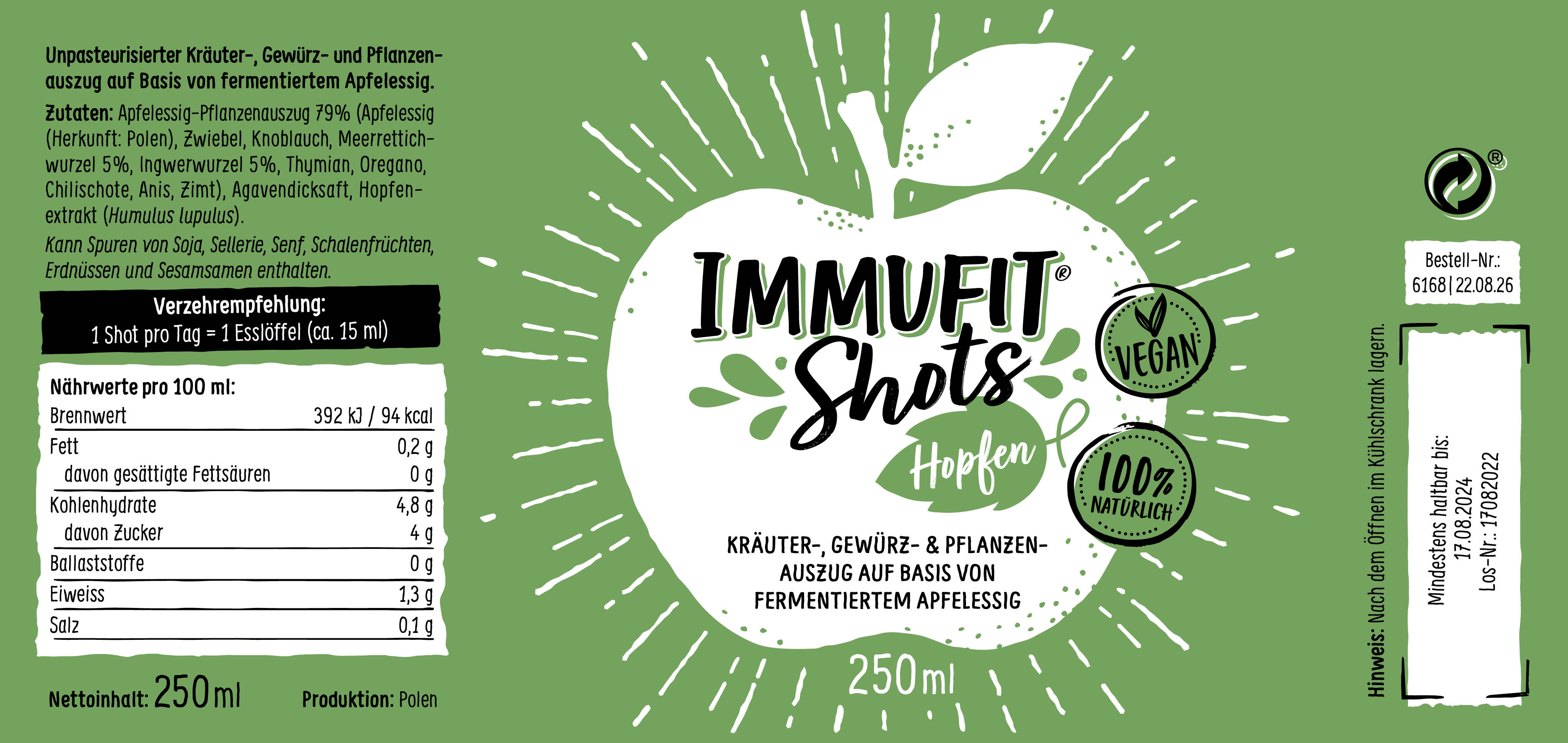
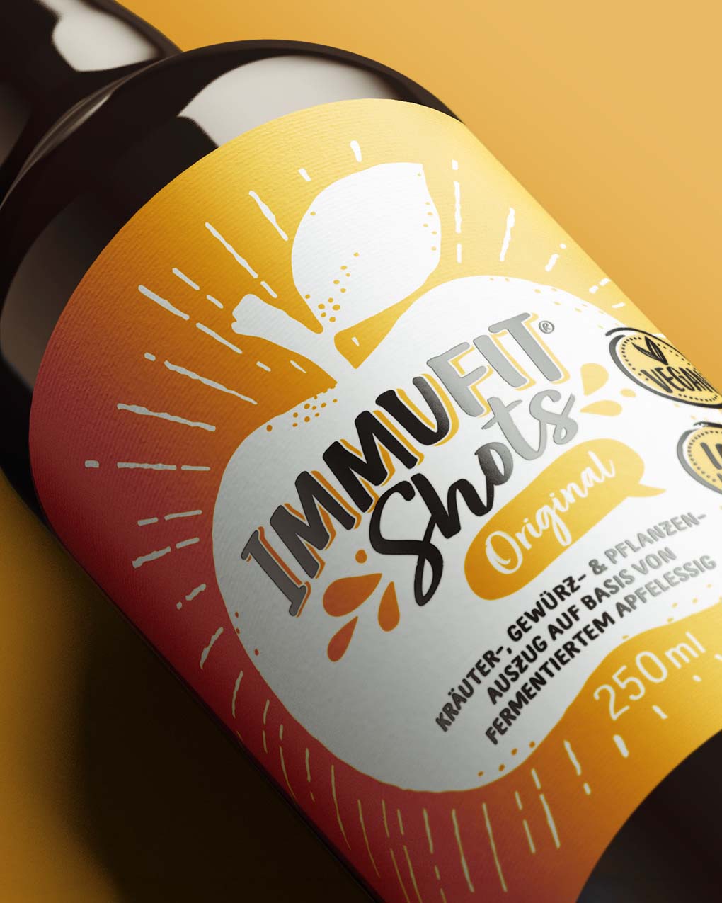
We positioned ImmuFit somewhere between functional wellness and lifestyle energy brand. Loud color blocking, high-contrast typography, and punchy compositions were used to reflect the intensity of the product itself — sharp, active, and immediate. Rather than leaning into minimal “clean health” aesthetics, the identity celebrates visibility and youthful optimism. Every touchpoint was designed to feel fast, fresh, and full of life while still carrying a subtle sense of ritual and repetition.
We positioned ImmuFit somewhere between functional wellness and lifestyle energy brand. Loud color blocking, high-contrast typography, and punchy compositions were used to reflect the intensity of the product itself — sharp, active, and immediate. Rather than leaning into minimal “clean health” aesthetics, the identity celebrates visibility and youthful optimism. Every touchpoint was designed to feel fast, fresh, and full of life while still carrying a subtle sense of ritual and repetition.
We positioned ImmuFit somewhere between functional wellness and lifestyle energy brand. Loud color blocking, high-contrast typography, and punchy compositions were used to reflect the intensity of the product itself — sharp, active, and immediate. Rather than leaning into minimal “clean health” aesthetics, the identity celebrates visibility and youthful optimism. Every touchpoint was designed to feel fast, fresh, and full of life while still carrying a subtle sense of ritual and repetition.


ImmuFit entered the wellness category with a distinct emotional and visual presence — youthful, vibrant, and impossible to overlook. The brand reframed probiotic health as something expressive and energizing, creating a ritual that feels less corrective and more empowering.
ImmuFit entered the wellness category with a distinct emotional and visual presence — youthful, vibrant, and impossible to overlook. The brand reframed probiotic health as something expressive and energizing, creating a ritual that feels less corrective and more empowering.
ImmuFit entered the wellness category with a distinct emotional and visual presence — youthful, vibrant, and impossible to overlook. The brand reframed probiotic health as something expressive and energizing, creating a ritual that feels less corrective and more empowering.


Related Works